
Thursday, September 3, 2009
Sunday, August 16, 2009
Busta Guggenheim-en
Anyway, today was my first venture into the facility known as the Guggenheim New York. 'twas most appropriate as a first visit as the primary exhibition contained the life's work of a certain Mr. Frank Lloyd Wright. (More on him in a subsequent post.)
I will preface my observations by saying that I had first read about the exhibition in, perhaps it was June's, Architectural Record. In the issue were two articles, one intended to alert readers of the summer-long exhibition and one intended to critique it. The critique was pretty... harsh? To paraphrase, "the displays suck, the tables suck, the lighting sucks, even the name of the exhibition sucks. You can't ask a museum curator to understand architecture." Perhaps I dramatize. Additionally there was an article in a recent Metropolis magazine highlighting the exhibition, though the contents of the article were far less pointed.
In mine own observations, off the bat the "bowl" portion of the museum seemed small. I reckon in the glossies, there is always a tendency to convey a much larger space than as in actuality (I felt a similar volumetric letdown at the Jubilee Church by Meier). It was a little chaotic getting started - maybe I was just exhausted from my foot trek around NYC, or I was overwhelmed by the masses of people. The elevator was an implausible first step (huge ass line), and the stairs were fragmented - a couple flights here, a couple flights there. I imagine it would be a far more enchanting experience if it weren't for the humidity and swarms of tourists. Damn people, ruining architectural space.
Descending the ramp, I found the irregular slope to be somewhat uncomfortable. Maybe that's due to my positional sensitivity and proneness to vertigo. Like how I offer jabs and follow up with excuses? As the museum is round, it does seem impractical. How many paintings or artworks do you create on a curved medium? The way they rigged the drawings against the rounded outer wall had a rather adverse effect. It made an already darkened (from age) drawing difficult to read. I guess you can't shine light directly onto 90-year-old masterworks. Also the tables in the center of the floor were odd, though I'm not sure how else one would display items in that space. I think the various models were displayed quite nicely, however. That is, the ones that were head-height. Placing a fine-crafted model at waist height is somewhat of a... waste. Pun intended.
In conclusion, the building would be a much more comfortable experience without all the people congesting it. That's somewhat of a crummy sentiment when it comes to a public building. Then again, that's just me, and heaven knows I my designs have flaws.
As for the work contained within this great white beast, I found them most satisfying. I had hoped to see more residential projects, as far as I remember only Taliesin was the only one presented. Most of his presented works were "unbuilt." Though it was definitely righteous to check those out. It is possible I missed a side room that contained more of the smaller scale projects, but somehow I doubt it. I will also note that at several drawings I couldn't help but think, "man, if I showed up to a crit with this I'd get torn up." Not to say his drawings weren't beautiful, he tended to turn each one into a composition. But some of them, I could see a juror saying, "if that's how you're going to draw cars, you should just leave them out of it." or "are those figures to scale? They look disproportionate." Or "your inconsistent hatching is distracting." Again, dramatization.
Perhaps further comments will surface in the future, for now I am spent. 'twas a long hot day and I have exhaustion. I will conclude that I am super glad I finally got to the Guggenheim and that it was for this exhibition. I wonder if it is always as crowded as it was (we waited in line about 15 minutes for tickets).
Monday, August 10, 2009
And Then There Were Three
We have all at least heard of the New York Five, a group of provocative architects who were the standard-bearers of neo-modernism, each one of them a unique individual, each one of them obedient to a common dogma. Personally, I like to think of them as the characters of a Saturday morning cartoon show or a boy-band. Just think. It totally works:
The Quiet One
The Tough One
The Funny One
The Cute One
The Nerdy One
I’ll let you guess which one I think is which. Of course, Arthur Drexler is Simon Cowell.
But on a more serious note, this month we lost Charles Gwathmey at 71 to esophageal cancer and while he may not have been the most famous of the Five, he was part of a movement that defined a lot about what architecture is today, especially in the United States. Gwathmey was born in 1938 in Charlotte, North Carolina. He did his undergraduate degree at Penn and got his masters from Yale. His first major work was the house he designed for his parents in the mid 1960’s:

This work, unlike so many early modernist works of the 1920s and 30s, is not additive, but subtractive. When looking at any Le Corbusier work you’ll see his theories of the basic Roman forms connecting to create a whole, but here in the Gwathmey House you’ll see that the building was already a whole, to which the cuts have been made and portions removed so that we may live in the nook. Like a bird living in a tree or marble as it is chipped away to become a sculpture. Where modernism stopped there the Five began.
Probably the most famous of all his works was the addition to the Guggenheim Museum in New York, originally designed by Frank Lloyd Wright and opened in 1959 (Wright had died six months before the official grand opening). In the early 1990’s Gwathmey Siegel & Associates Architects LLC was commissioned to make an addition to the iconic building and the controversy was rampant. There were some who would have preferred an entirely new building built to house the over-flowing connection somewhere else rather than an addition to the pre-existing. When Gwathmey and Siegel’s scheme was revealed the collective snickering response was:
“They’ve made the Guggenheim into a toilet”


(This was especially true for me, because I was seven at the time and anything that has to do with a toilet was, is, and will forever be, hysterical.)
However! If we look past the one-liner, we can see that by creating an addition specifically different in form, texture, philosophy and soul, Gwathmey wanted to create a balance for the Guggenheim. Gwathmey put up something so radically unlike the original that no one would ever confuse them. By creating a building that is a humble backdrop (though he would never agree that the addition is either humble or a backdrop), Gwathmey may have saved Frank Lloyd Wright’s magnum opus the shame of having a pretentious copy built next to it. Can’t you just see it? Just lying there, embarrassing everyone who would have had to walk by. Love it or hate it you have to admit Gwathmey was wise not to try and imitate or intimidate a master.
As for his affiliation with the New York five, they went the way all boy-bands go. One of them flirts with an equally volatile pop-singer who drives a wedge in the group (I’m looking at YOU Michael Graves/Postmodernism) and eventually they all break off and start solo-careers. Some of them can escape the Teen Scene (Architectural Record), Tiger Beat (Harvard Design Magazine) and, god help you, BOP (Architectural Digest) posters but most can never shake what they used to be. But Gwathmey didn’t want to, like Richard Meier, he truly believed that modernism holds the answers to Architecture. This is not to say his style didn’t evolve and mature, but he never lost what the New York Five was really about.


Also, in case you were wondering:
John Hejduk
Richard Meier
Peter Eisenmann
Michael Graves
Charles Gwathmey
In that order specifically.
R.I.P. Charlie you'll be missed.

Wednesday, July 22, 2009
2009 Design Awards
TADA!
#1: SHoP Architects -
On their website SHoP architects have a flash intro on their basic beliefs.
"Efficiency and great design are not mutually exclusive"
"Push Design, embrace responsibility"
These two statements are clearly a reference to sustainable design. I have to complement them on the fact that they could touch on sustainability without having to use a word that is getting simultaneously tired and taboo: Green. Throughout my time in architecture school one of the driving points was to create a building that was as "green" as possible, that is, environmentally friendly. This often meant that the grand gestures were either:
a. diminished
b. bullshit.
This lead me to believe that the only truly environmental building is this:

I think SHoP design follows a great change in the discussion about sustainability: through these two dogmatic statements they explain that environmentalism is not the goal of architecture, it is a method in which architecture will flourish. I believe this method that will become standard. Just like steel 100 years ago.
they also had another one:
"Building Buildings is better than talking about buildings"
ooooh SHoP you're so edgy. You know, I like this.....I especially liked it when Frank Furness said it in 1880.

nice try.
SHoP Architecture Projects:

this one is almost a little too much Shigeru Ban. But I buy it.

#2: Architecture Research Office
"ARO communicates ideas clearly in a consistent language. It frames city life as well as natural beauty. Ideas about site, program, and daily activity are conveyed through its use. Compelling to look at, appealing to touch, this architecture is as sensuous as it is intellectually rigorous."
How retro. Architecture that is concerned with texture and materiality more than their statement about texture and materiality. The other thing I find interesting about this particular firm is that they're not afraid to have an individual style. Sometimes it's nice to look at a building and know whose behind it.
.jpg)
#3 Michael Maltzan
"Michael Maltzan... creates progressive, transfomative experiences throughout the concentrated exploration of movement and perception, charting new trajectories for architecture, urbanism and the public realm"
Transformative? I'm sorry but if spell check is confused by your word choice: I start getting suspicious.
So I began to research: going strictly textbook, the word "Transformative" comes from Transformative Learning Theory. which is:
"becoming critically aware of one's own tacit assumptions and expectations and those of others and assessing their relevance for making an interpretation"
So let me get this straight: you are "critically thinking". No matter how usefull you think your thesaurus is, there is only so far you can go with it. The only thing Maltzan really proved with that statement is that he likes to make cool forms and thinks that he needs some Mezirowian filler to make it legitimate...that and he passed freshman english 101.
Michael Maltzan Projects:


I had one other problem with Maltzan:


Can you tell who was the architect between these buildings? On the left is Michael Maltzan on the right is another, much more famous architect. I know it's sometimes considered unsporting to base an opinion solely on aesthetics and I don't even know if Maltzan is influenced by the other architect. But all I can say about Michael Maltzan's aesthetics is that:
 =
= 
I can't believe it's not Zaha.
Saturday, July 11, 2009
COMIC UPDATES!
Eisenmann and Graves part 1
http://chillicheesefries.deviantart.com/art/E-and-G-part-1-129145656
Eisenmann and Graves part 2
http://chillicheesefries.deviantart.com/art/E-and-G-part-2-129145811
Eisenmann and Graves part 3
http://chillicheesefries.deviantart.com/art/E-and-G-part-3-129145955
Louis Kahn gets into fights part 1
http://chillicheesefries.deviantart.com/art/Kahn-starts-fights-part-1-129146214
Louis Kahn gets into fights part 2
http://chillicheesefries.deviantart.com/art/Louis-Kahn-fights-part-2-129146345
Maya Lintakes out a restraining order
http://chillicheesefries.deviantart.com/art/Maya-Lin-is-worried-129146650
Wednesday, July 8, 2009
Scotland: Last Day
Part 18: And you thought there weren’t anymore castles…silly, silly. GLAMIS!
So tomorrow we leave via Aberdeen, and but there is still time for one more outing; to Glamis Castle in the small town of Glamis in Angus. The town of Glamis is a charming village, but unlike the charming villages of the north, there is a staged quality to them. Like a walk-through at a museum.
CASTLE!
http://www.paranormalknowledge.com/articles/wp-content/uploads/2009/03/glamis-castle.jpg
The Castle Glamis most recently was the home of the Queen Mother as well as the birthplace of Princess Margaret. There was a strong attachment to both of these women; the Queen Mother because she represented the last of a Victorian culture that was dying out and Princess Margaret, who represented the fearlessness and confidence and spite of the 60s. Though the two women whom the now castle represents are polar opposites, there is an indefinable association. I mean, what family doesn’t have the uptight grand matriarch or the rebellious aunt?
The architecture of Glamis Castle can be traced back to an early Pictish grave:
http://www.uoregon.edu/~klio/im/med/pict.gif
however, for the most part the construction took place relatively between 1200 and 1400 A.D. however, as is a recurring theme with Castles in this area there is a timeline of additions, remodeling and demolition (either by choice or by war).
The final result is an extremely heavy form that carries with it the battlements, ramparts and a collage of fenestration that shows the evolution of style. The hard thing about analyzing Castles is the lack of arecurring exterior consistency.
It’s a case by case basis as to the aesthetics, and I’ll be honest, while I like the look of Glamis, I think I preferred Fyvie. The true difficulty of these Castles is that they kind of a smack in the face of everything you learn in architecture school. One of the themes that gets pushed down your throat is that everything must have a concept and must have a deep psychological or metaphysical meaning, and that any other solution is something somehow less meaningful or stupid.
In the design of Glamis Castle there is essentially nothing much more in the concept other than power, defense and maintaining image. Here you will find no questioning our place the universe, no romantic-poetesque whimpering about how unfair the world is; rather each move made is not in anyway humble or apologetic and yet, not overly arrogant, strangely balanced in that way. Sometimes I feel like a lot of contemporary Architecture is constantly tripping over itself either to deliberately offend or overly apologize but here the Castle gives off the sense of “Do what you want, I don’t really care”. It’s powerful in its apathy, like those kids in high-school who would hang outside the 7-11 and smoke.
The main problem with the interior of Glamis is that they have too much stuff. While the architecture is apathetically powerful, the interior is hopelessly Victorian; layer after layer of tapestries, ceramics, paintings, oiled wood, and Italian plaster. I mean elegant objects and true elegance are different. To paraphrase:
“Simplicity is the sign of true elegance” and to probably misquote my brother: “Elegance is simplicity and efficiency; Example 1: Violence. Maybe not always the best option, but you cannot deny it’s elegant.”
In addition to tapestries, Glamis Castle is also wallowing in myth and folklore.
Myth 1: It is in this castle that the Literary Macbeth lived. You remember the Historical Macbeth lived in Cawdor. We entered the room which inspired the setting for the murder of Duncan, which was cool, but built about 200 years too late to have been accurate.
Myth 2: Earl Beardie and a few of his guests were playing cards one night on a Saturday and were warned by a servant that it was growing close to midnight and it’s a sin to gamble on the Sabbath. The Earl ignored the warnings and continued to play, just after midnight they were joined by a handsome stranger who played with them. Just before dawn the Earl mentioned how much fun he had had and said “I would play that game til’ the end of time”. Lo, his wish was granted, because the man who had joined them was, in fact, the Devil. It is said that if you put your ear to the stone on Saturday nights, you can people playing away. The game they’re playing? Probably “Patience”.
Myth 3: In the chapel there is always a place saved for “The Grey Lady” thought to be Janet Douglas, The Lady Glamis who had been burned unfairly as a witch in 1537. It is said she wafts in from time to time, says her prayers and disappears.
That any much, much more, next time of Scottish Tragedy Theatre.
The last, and best, part of this castle was the garden, in particular the trees, which ranged from Oak to Cedar. One row of trees looked like topiaries, but when you walk through it’s a wonderful surprise because looking up you see a wild tangle of branches that defy the trimmed and perfect look from the exterior. The madness within.
After Glamis we drove up to Aberdeen and got checked into a hotel just in time to catch the last of Michael Jackson’s funeral.
Monday, July 6, 2009
It finally happened
Part 17: Monkfest 1282
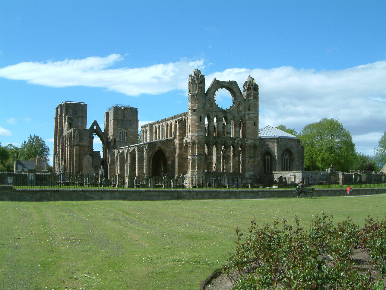
It had to happen sometime; we had to go to a ruin that wasn’t a castle. Lo and Behold we found Elgin Cathedral. We started off at the nearby Biblical gardens of Elgin, which were charming, but had some really strange statuary.
http://www.armin-grewe.com/holiday/scotland2001/elgin-biblical.jpg
They weren’t really copper or steel; they were plastic filled with foam.
ELGIN CATHEDRAL!!!!!!!
http://www.electricscotland.com/historic/pics/elgin%20cathedral%202.jpg
So super sweet. The interesting thing about this cathedral is that unlike many cathedrals built at its time Elgin Cathedral did not have a specific allegiance to any one order of monks. Elgin had in it’s midst Benedictines, Cistercians, Fransiscans, etc. etc. depending on the time. This means that their architecture is somewhat unique. Each branch of monks would have had particular things they would have done in the building of a church. In particular the Cistercians, who would use the same floor plan in every structure they built. It was once said that any monk could find his way around any Cistercian Cathedral as easily as they could get around their own room regardless of where in the world he was.
But this somewhat politic disassociation means that they don’t have to pay homage or follow the rules of any of those lofty orders. Nope, this was strictly for the Bishop, who, by the way, had really nice digs on the opposite end of the Cathedral.
http://www.geo.ed.ac.uk/scotgaz/images/p4455.jpg
The galleries on either side served as semi-flying buttresses, they pull weight away from the interior of the building, but they are not strictly structural, it is also important to note that they have rather thick regular buttressing along the exterior. Because of the thickness and regularity of the columns in the nave as well as the relative short height of the roof there was no need for there to be massive flying buttresses anyway. The front façade towers were pretty interesting, unlike many other cathedral towers I have been to, Elgin actually lets you into the rooms throughout the towers, which would have been used for meeting rooms, storage and living quarters if necessary. These are actually pretty expansive rooms with the Musicians’ gallery serving as walkway from one tower to another.
The Chapterhouse was another very interesting part. It was organized as a Heptagon with 5 of the sides being used for seating and two being used for entrance and exit. This is where the higher-ups of the church would meet to discuss the rules of the monasteries. One would sit under one of the five symbols etched into the glass and stone above your head. Quite possibly these symbols represent the vows you would take when you entered monastic rule: Poverty, Chastity, Obedience, Silence and, above everything else, To Serve God.
So what happened to Elgin? Why did it become a ruin. Well, three reasons.
First, in 1390 it was partially burned down by a Knight who had been excommunicated when they stopped paying him protection money.
Second, in 1402 it was again burned in an attempt made by the landed gentry to confiscate the church’s power in the region.
And Finally, after two attempted destructions it finally succumbed to the Scottish reformation and fell apart from abandonment around the 1600s.
Still, it is painfully, tragically beautiful.
Part 18: Can you believe this wool?
The next stop was at a local Cashmere factory, where I splurged and bought a coat (which was ironically not cashmere). BUT! IN MY DEFENSE! It had been marked clearance, was not much more that a coat I would have paid for at home, and was super, super cute.
It turns out that Cashmere factories in Europe are facing a tough time from Chinese manufacturers; over and over again I was lectured on the benefit ofquality over price. And I have to admit there were some beautiful pieces on display that were worth more money than my life.
Hermes, Versace, things like that. Man, it must be convenient to be obscenely wealthy.
For lunch we stopped at nearby Baxter’s Factory and café. Baxter’s is essentially Scotland’s Campbell’s, so what can I say besides mm. mm. good.
Part 19: The Valley of the Deer
We rounded out the day with a tour of the Glenfiddich distillery, the whiskey which takes its water from a spring the river Fiddich takes its name from the valley. This literally means “The Valley of the Deer”, hence the stag on the bottle. Here are a few things I learned on the tour:
1. Glenfiddich Scotch Whiskey is always stored in oak barrels for at least 12 years
2. They have their own coopers (barrel-builders) on the premises
3. They have an artist in residence that changes every year
4. The wood used in the barrels must have had another kind of liquor in it first, most of these either come from Spain (where they use it for sherry) or from the U.S. ( where they use it for bourbon)
5. These barrels are only used about 4 or 5 times and then they are turned into furniture, or rarely in the case of the Tuns (the large heated vats) houses.
6. I can, in fact, still drink scotch whiskey (something I thought I was incapable of). I must therefore conclude that I am no longer capable of drinking cheap whiskey.
Overall a nice tour, but I couldn’t escape the thought that they just wanted to get me drunk. I resisted however and returned to Buckie.
Well that’s all for now. Stay tuned for the last day in Scotland tomorrow!
McCormick-out.